Community Portal redesign
We’ve refreshed the portal to align it with our other platforms. Here’s what’s new:
- Streamlined Design – The look and feel is now consistent across all portals for a smoother experience.
- Clearer Detail Screens – Topics are displayed on separate cards, making information easier to find and digest.
- Cleaner Layout – The interface feels more modern, fresh, and uncluttered.
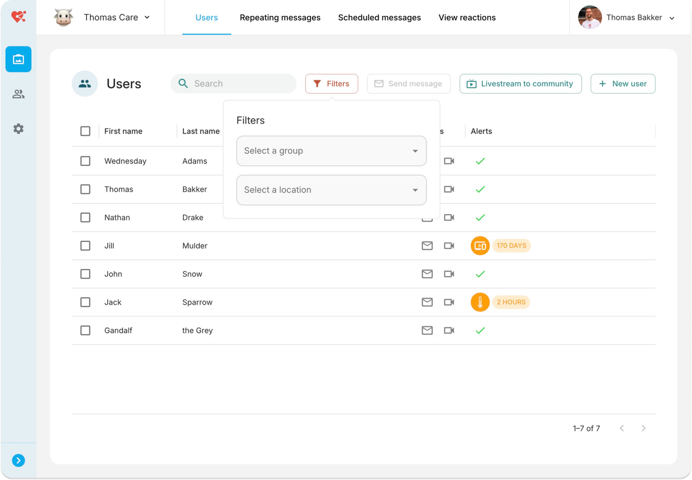
- Smarter Filters – On the Users page, filters now take up less space and expand only when needed, giving you more room to focus on what matters.
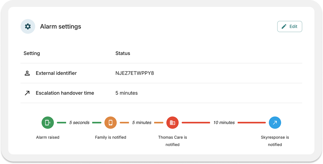
Example card in the user detail containing all alarming settings in a glimpse. Visuals have also been added to give a better understanding of the impact of your settings.